How Premium Brands Develop Color Cards & Fabric for Next Sportswear Season
- Share
- publisher
- sunny
- Issue Time
- Dec 19,2025
Summary
How premium activewear brands create next-season color cards and fabric stories that shape cohesive collections.

After working closely with premium activewear brands across Europe and North America, one pattern is consistently clear:
successful seasonal collections do not start with silhouettes.
They start with a clearly defined color card and fabric story.
From a manufacturer's perspective, brands that invest early in these two foundations tend to move faster in development, communicate more precisely, and achieve stronger consistency from sampling to bulk. Color and fabric are not styling details—they are the strategic framework that anchors the entire season.
1. Color Cards Are the First Decision, Not the Last
In our experience supporting high-end brands, color cards function as the visual blueprint of the season.
Brands use them to:
-Protect core brand identity while introducing seasonal freshness.
-Decide which colors carry volume, which support hero styles, and which remain limited.
-Align multiple categories—yoga, training, running, lifestyle—under one visual language.
When color direction is defined early, product development becomes clearer and more efficient. Patterns, trims, and even construction choices are made with confidence instead of constant revision.

2. How Premium Brands Define Seasonal Color Direction
Premium brands rarely choose colors based on intuition alone. From the manufacturing side, we see color decisions informed by a combination of strategy and data, typically including:
-Macro lifestyle shifts (wellness, outdoor influence, minimalism, digital culture).
-Social media performance and emerging color signals.
-Sell-through data from previous seasons.
-Regional climate and market differences.
-Cross-industry inspiration from interiors, beauty, and footwear.
These inputs help brands determine whether a season should feel calm and neutral, energetic and expressive, grounded and earthy, or clean and technical.
3. Translating Direction into a Structured Color System
Rather than listing random shades, premium brands build layered color systems.
In practice, this usually means:
-Core colors that run across multiple categories and seasons.
-Seasonal statement colors reserved for hero styles or campaigns.
-Accent tones used selectively for capsules or limited drops.
This structure keeps assortments visually cohesive while controlling complexity. For manufacturers, it also creates clearer guidelines for lab dips, bulk dyeing, and MOQ planning.
4. Fabric Stories Define How the Season Feels
If color defines the visual mood, fabric defines the emotional and tactile experience.
High-end brands don’t select fabrics in isolation—they build fabric stories around how the season should feel on the body. Common themes we help brands develop include:
-Soft-luxe performance with brushed or naked-feel surfaces
-Sculpted technical looks using matte compression and stretch wovens
-Hybrid outdoor textures that balance protection and flexibility
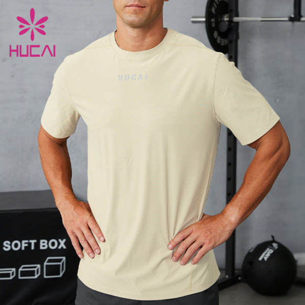
-Comfort-driven lifestyle knits for everyday wear
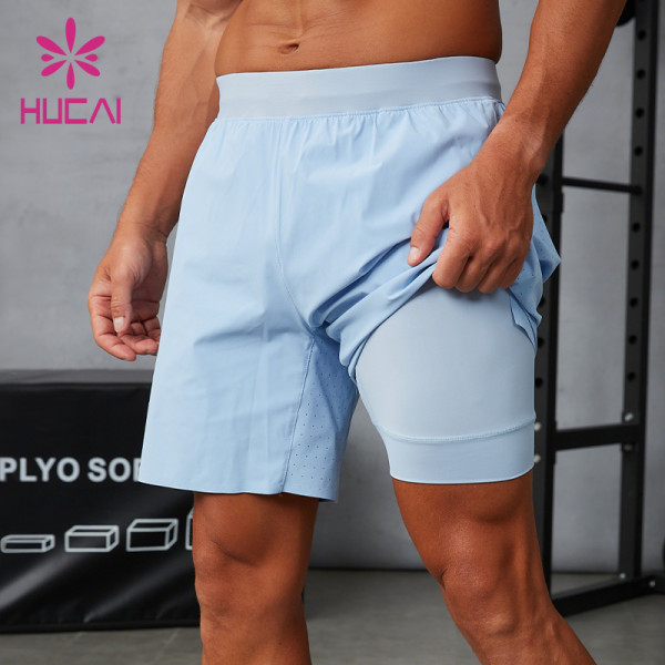
For example, yoga-focused collections often emphasize peached interlock and soft stretch knits, while performance-led lines lean into structured compression, breathable mesh, and lightweight wovens.

5. Aligning Color with Fabric Texture
In premium collections, color and fabric are always developed together.
From our sampling experience:
-Soft, muted tones appear more refined on matte or brushed fabrics.
-Bright athletic colors perform best on smooth technical bases.
-Earthy shades elevate rib, waffle, and soft-knit structures.
-Neutral greys and off-whites pair naturally with lightweight outer layers.
When color and texture reinforce the same story, brands can achieve depth without relying on heavy graphics or over-design.
6. Turning Creative Direction into a Commercial Assortment
Strong concepts only succeed when they translate into practical merchandising decisions.
The most effective brands we work with typically ensure that:
-Core colors repeat across key categories to strengthen continuity.
-Seasonal highlights support campaigns without overwhelming the range.
-Hero fabrics are shared across multiple product types to optimize MOQs.
-Accent colors are placed where visibility is highest and risk is lowest.
This alignment allows design, sourcing, and production to move in sync—reducing friction and improving execution quality.
From a manufacturing partner's perspective, premium brands that start with clear color cards and fabric stories consistently achieve smoother development and stronger collections.
These early decisions define not only the emotional and visual identity of the season, but also the efficiency of sampling, sourcing, and production. When color and fabric direction are clear, OEM collaboration becomes more predictable, scalable, and successful.
Need support developing your next-season color card or fabric story?
HUCAI works closely with premium activewear brands on color planning, hero fabric development, and full OEM/ODM execution.Welcome to consult us anytime!